Writing about Photography.
Photography is a visual medium and as photographers we express ourselves with the images we make. The thought processes during this work, before we shoot, during the shoot and later in post production can be from the most simplistic to the most profound but generally stay within the subconscious. Having chosen the camera over the typewriter a decision was made to suit our abilities and aspirations. When we look at the photographs made by others we ask ourselves questions and build to a position where we gain something from the experience. Putting that response into words in an orderly fashion is the crux of this first section. The initial work of captions is often the stating of the obvious and has to be achieved within set guidelines, depending upon the audience. Writing about photography and photographs is always going to have an element of subjectivity although a structure is necessary and the audience's potential knowledge of the subject needs to be taken into account. Writing academically has a more structured approach with guidelines on research and writing style and I have found the research carried out so far to be interesting and inspiring. A trait however is to go off at a tangent and read outside of my immediate needs and as a result get behind with the prescribed work. This was particularly so with the analysis of London Street 1951, Robert Frank. Frank was a name I knew but until this research I had not realised the genius of his work and I am spending more of my time with London/Wales and the ITV The South Bank Show film made prior to his 2004 exhibition at Tate Modern.
As an introductory essay Understanding a Photograph, John Berger was not the easiest piece to get to grips with. I knew nothing of Berger at the outset and found the various films on YouTube (particularly his TV series Ways of Seeing) a useful introduction into the world of this curious (fascinating) man. He is better know in literary circles as an author, art critic and poet. His analysis and critique of various photographic work is contained in a relatively new book Understanding the Photograph, 2013. At first I was quite hostile towards him and I think most photographers faced with a non photographer offering such controversial opinions feel the same. Thereafter I began to mellow and surprisingly enough I now find myself agreeing with much of what he says. Time (his essay was written in 1972) has proven him wrong on a few issues but generally speaking his consensus that photography is not fine art will always bear a degree of truth.
To be able to write and analyse photographs and essays on photography is not easy. I have read many texts on how to achieve this and there is one underlying "must have" and that is the time spent on research. The British Journal of Photography and Source magazine are an excellent resource of essays on contemporary photography and I spend more time now reading these and following up introductions they make to new photographers. The single most overwhelming issue I have to overcome when writing about (or just thinking about) photography is to put aside any preconceived ideas and opinions that I may have which are personal and without a cogent argument. I then need to make sure my research is carried out sympathetically and carefully, without bias and detailed enough for the work in progress.
It is difficult to know to what extent any of this is having on my own photography. I take fewer "pretty" pictures and spend time on work based on abstract ideas, much of which never sees the light of day. The act of writing about photography is adding to my subconscious reaction to photographs and photography and it would be wrong to say that I work differently due to a single learning moment but I have changed as a photographer during this (level 2) process.
Saturday 22 February 2014
Friday 21 February 2014
Exercise - Analyse an Essay
Understanding a Photograph, 1972 - John Berger
After my initial reading of this essay I decided there was a need to understand more about John Berger and who was influencing him. In the introduction to the book Understanding a Photograph, 2013 the editor Geoff Dyer explains that Berger is heavily influenced by Sontag's On Photography and how Barthes is"the only living critic and theorist of literature and language whom I, as a writer, recognises". All three had been influenced by Walter Benjamin's A Small History of Photography, 1931.
An essay written in 1972 and influenced by such eminent writers and theorists as Sontag, Barthes and Benjamin will to some extent be out of date in 2014 when compared to contemporary thinking and practices, especially around the work of museums and their curators.
Analyse the various paragraphs, in one sentence.
1.Photography, in the view of most people is not Fine Art and those that argue otherwise do so academically.
2.Few museums have space for photography and therefore only a small number of photographs are preserved in isolation away from the public.
3.Art (Painting, Sculpture) cannot survive and not become valuable as property, whereby it gives protection to the owner.
4.Photographs cannot be art as they have no rarity, they are not unique and as they are not valuable as property they cannot be considered.
5.Photography is a record of what the photographer wants to record and is a human choice.
6.The photograph has a message and the photographer's decisions during its making render it memorable or banal.
7.Composition when considered in photography is different to composition in painting and fine art because painting is an art of arrangement.
8.A photograph relies upon the viewer to have some knowledge and understand its meaning.
9.The photographers only choice is to photograph when not what, thus determining absence versus presence.
10.Photography is a moment in time, recorded in isolation while a painting is made over time and has a different language.
11.A photograph is an image of isolation, recording a moment and is valuable for what is not shown as for what is.
12. There is value in a photograph if it portrays truth, a decision however that remains with the viewer.
13. The message within a photograph may be more complex than first attributed.
14. Photography, due to its truth is powerful when used as a weapon.
What is Berger's Argument ?
He is arguing that photography is not fine art because as an object it is not unique. He believes it to be a means of recording a moment in time and as such is devoid of artistic arrangement.
John Berger is well known for his socio-political stance. How is this reflected in the argument that he presents in this essay ?
Berger is an artist, author, art critic, poet and self confessed Marxist. He argues quite strongly that photography is not art but as a weapon in an ideological struggle that can be used for and against us. In 1972 he wrote that photography was not in museums and therefore had not been preserved in isolation away from the masses. If photography were to held in museums it would be hidden. This is not correct and in 2014 photography is in museums and being seen and witnessed by the masses.
Are you convinced by Berger's Argument ?
As an ideological piece of work there is much of Berger that is still relevant despite the 40 or so years that have passed. The world of museums and their curators have moved away from his thinking and most collect and display photography as fine art although the commercial gallery is more often interested in the value of the work rather than its artistic integrity. As a photographer I do not feel violated when photography is not seen as art, so in that respect I agree with Berger and I abstain from the argument when amongst artist from the more established disciplines. Its lack of uniqueness and rarity is an overwhelming argument one would think. However the value of sales of photographs has risen into six figure sums which displays an appetite amongst collectors for this medium.
What is your opinion of Berger's writing style ?
Berger writes in an academic style and that initially made it difficult to understand. I was often wondering if there were just too many words but after reading this essay and others in Understanding a Photograph 2013 I begin to understand his argument not only at a superficial level (the words) but within the words there is more of Berger. From an initial skepticism I am prepared to read more from this highly respected artist and writer.
Thursday 13 February 2014
Writing Analytically - Exercise - Research and Analyse
Following on from the exercise to analyse one of my own photographs the task now is to write a similar analysis on one of the following photographs.
- Pikes Peak Park, Colorado Springs, Colorado 1970 Robert Adams
- London Street 1951 Robert Frank
- Shell-shocked Soldier, Hue 1968 Don McCullin
- Afghan Girl 1984 Steve McCurry
Monday 3 February 2014
Furthering Monochrome Techniques
I am spending some time away from the prescribed coursework to improve my monochrome technique. I am passionate about the genre and find myself being defensive when asked to justify why I often work in this way. Through the coursework however I am writing about London Street, Robert Frank 1951 and as a result I have become captivated by his work. I am an easy capture however, having been seduced the past by Edward Weston, Eugene Atget, Edwin Smith, Alfred Stieglitz, Edward Steichen and Paul Strand to name but a few.
Robert Frank is quoted as saying


Robert Frank is quoted as saying
“Black and white are the colors of
photography. To me they symbolize the alternatives of hope and despair
to which mankind is forever subjected.”
We can see from the above list of photographers that influence me that none of them would have had that much opportunity to have used colour although there are a few exceptions, notably Weston who did some work late in his life with Kodak colour film.
As human beings (unless colour blind) we see the world around us in colour and to translate that into a black and white image with a full range of tones and contrast is not easy. There have been monocle type viewing devices with special filters that were an aid but I have never used one. I have though spent 30 years with black and white film and with digital photography needed a way forward where I could control the output with a greater degree of security of outcome. There has since the nineteen sixties been a tendency for high contrast punchy images, spawned by the likes of Bailey in the world of fashion and later the war photography of Don McCullen and may others all using modern multi coated lenses designed to produce contrast and extreme sharpness.
This style of black and white is legendary and many iconic images from the last 50 years are seminal works and part of the history of photography.
Prior to that period lenses were producing less contrast and for those like Cartier Bresson and Frank who were using uncoated Leica glass the resulting negative had a softer feel. The images were sharp but the contrast was less than a multi coated modern lens.
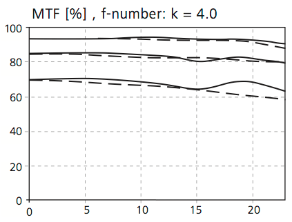
To understand which lenses are likely to give low or high contrast we need to understand Modular Transfer Function (MTF). MTF graphs can be confusing. A test image is taken using a target with varying line shapes.From inspection the image is plotted on a graph. On the vertical axis we see the change in contrast as a percentage from 0 to 100. Zero means no contrast at all (black is grey and white is grey) and 100% means full contrast (the black is still black and the white is white). All values in between indicate that a percentage of white light is spilling over into the black part of the test pattern. 50% contrast means there is a difference between the dark grey and light grey areas of 50%. On the horizontal axis we read the image height of the image area, the radius of which can be calculated from the diagonal of the picture frame. A 35mm negative has a diagonal of 43.2mm and the radius of the image circle is 21.6mm. Important points are the 3mm radius as this gives the center performance or the on-axis performance. The 12mm radius covers the image on the short side of the negative (2 times 12mm equals the 24mm vertical size). The 18mm radius covers the long side of the negative, whilst 21.6mm covers the extreme corners.
Within the horizontal and vertical axes we see four groups of curves which meander from centre to corner (0 to 21.6mm) On the top we have the contrast transfer for 5lp/mm (image resolution is the detail an image holds and is measure in lines per millimetre), which defines the overall contrast and the subject outline. Working down the four lines, next is10lp/mm, 20lp/mm and finally 40lp/mm which defines the maximum resolution and smallest points that the lens can record with some clarity. The solid line curves are paired with a dotted line. These represent the two different orientations of the line patterns. In practice the better results come from curves that stay as close together as possible. If the curves diverge widely we will see astigmatism and coma and in general a softness of the smaller image points.
MTF for Leica 35mm f/1.4 Summilux-R @ f/2.8
The graph above for the 35mm Summilux R lens at f2.8 shows good performance at the centre but poor at the edge of the frame, with considerable astigmatism as shown by the divergence of solid and dotted curves.
MTF Zeiss 100m f/2 Makro-Planar MTF at f/4
The graph above for the Zeiss 100mm f/2 Makro at f4 shows remarkable definition across the whole of the frame with very little astigmatism.
The low contrast negative can however be used to good effect in the darkroom. An increase in contrast is possible when printing to produce an image that has increased depth by enhancing foreground contrast and allowing the distance to remain in low contrast resulting in aerial perspective.
An example is seem in these photograph:
Stieglitz, A. The Hand of Man,1902, Copyright Museum of Modern Art, New York

Frank, R. London Street,1951, Copyright Victoria and Albert Museum, London
With digital practice there are a number of techniques to simulate the look and feel of a image with variable contrast. The important point to remember is that adding contrast is much easier that removing it, so to that end I always shoot raw files and ensure during the post processing that the curve is linear until I choose to add contrast with an S curve. Film stock has a curve and a recipe for how it reacts to the various coloured wavelengths of light. Adding these curves on layers and masking allows the creation of an image with varying areas of contrast.
In the image below the distant bushes in the top right have been left as low contrast, while the Marram grass and the wood of the beach hut have increased contrast. Also the area under the hut has low contrast to retain detail. The variable contrast areas add depth to the image and allow the less interesting areas to have the same validity as those in the foreground.

In the image below the distant bushes in the top right have been left as low contrast, while the Marram grass and the wood of the beach hut have increased contrast. Also the area under the hut has low contrast to retain detail. The variable contrast areas add depth to the image and allow the less interesting areas to have the same validity as those in the foreground.
Beach Hut Leica MM 35mm Summicron.
In the image below the grasses have high contrast in the centre with less towards the edges. The distant areas have no contrast adjustment and retain the original linear curve. The sand areas have contrast enhancement through the centre with less at the edges. The technique contributes to the apparent 3D in the image.
Footprints Leica MM 35mm Summicron
Conclusion
Lens selection should go beyond focal length and format. The contrast characteristics will play a large part especially when the image is to have areas of differing contrast. Prior to digital photography the older non coated lenses being used on say transparency film would have resulted in disappointing results, showing their age with low contrast results. The study of MTF graphs for a given lens allows the photographer an opportunity to understand its characteristics and select the lens to suit the output, which in most cases for my current landscape work is a mixed contrast image.
Subscribe to:
Posts (Atom)